The Brief
Justworks’ marketing materials featured display icons aligned with previous brand visuals. The task was to modernize these icons while infusing more emotion into their application.
Justworks’ marketing materials featured display icons aligned with previous brand visuals. The task was to modernize these icons while infusing more emotion into their application.
The Outcome
I developed simple, hand-drawn line illustrations that feel human and approachable while effectively communicating key messages. The background shapes, pulled from the brand's visual language, introduced color and flexibility in their use.
I developed simple, hand-drawn line illustrations that feel human and approachable while effectively communicating key messages. The background shapes, pulled from the brand's visual language, introduced color and flexibility in their use.
My Role
Art Direction
Illustration
Art Direction
Illustration
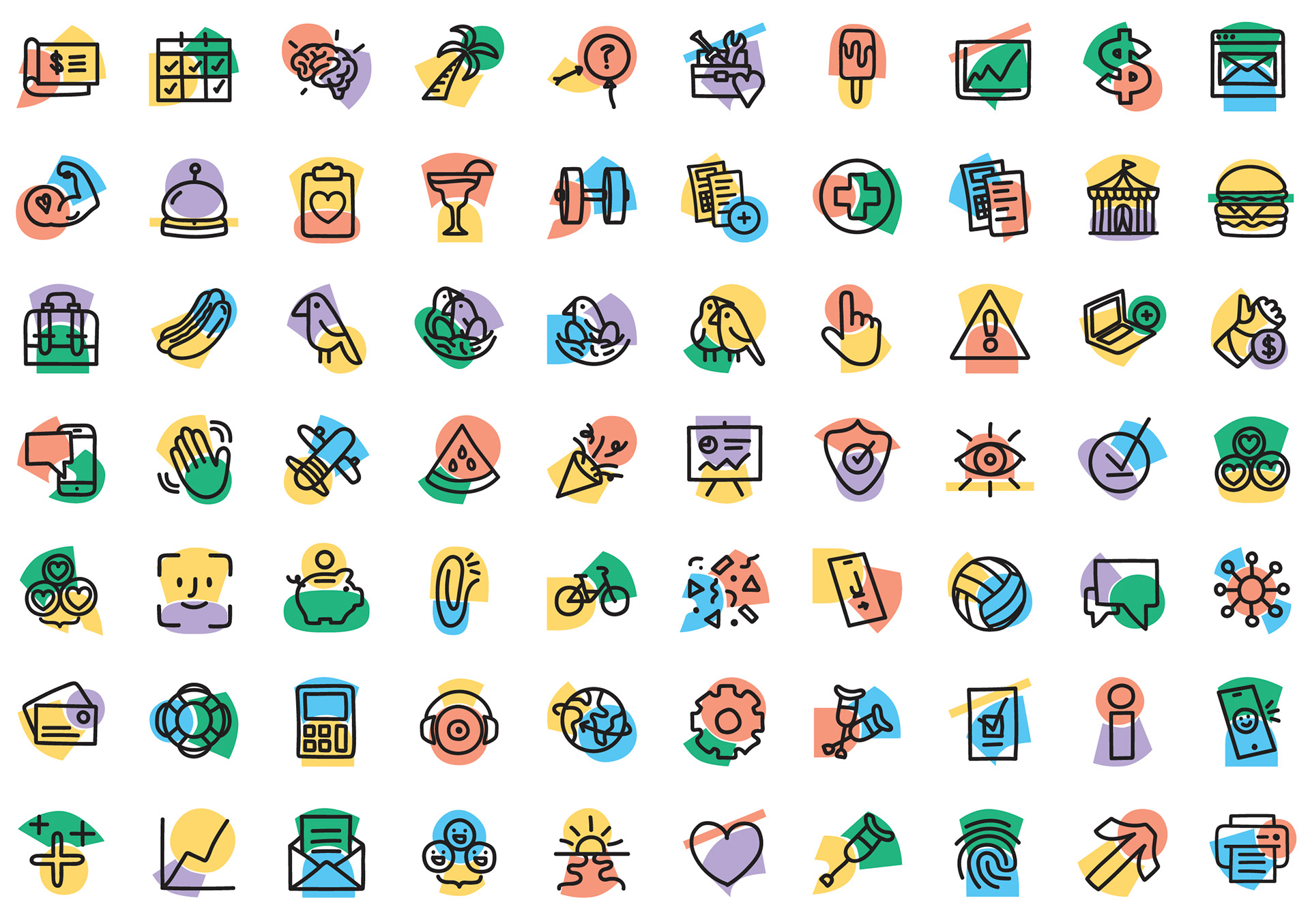
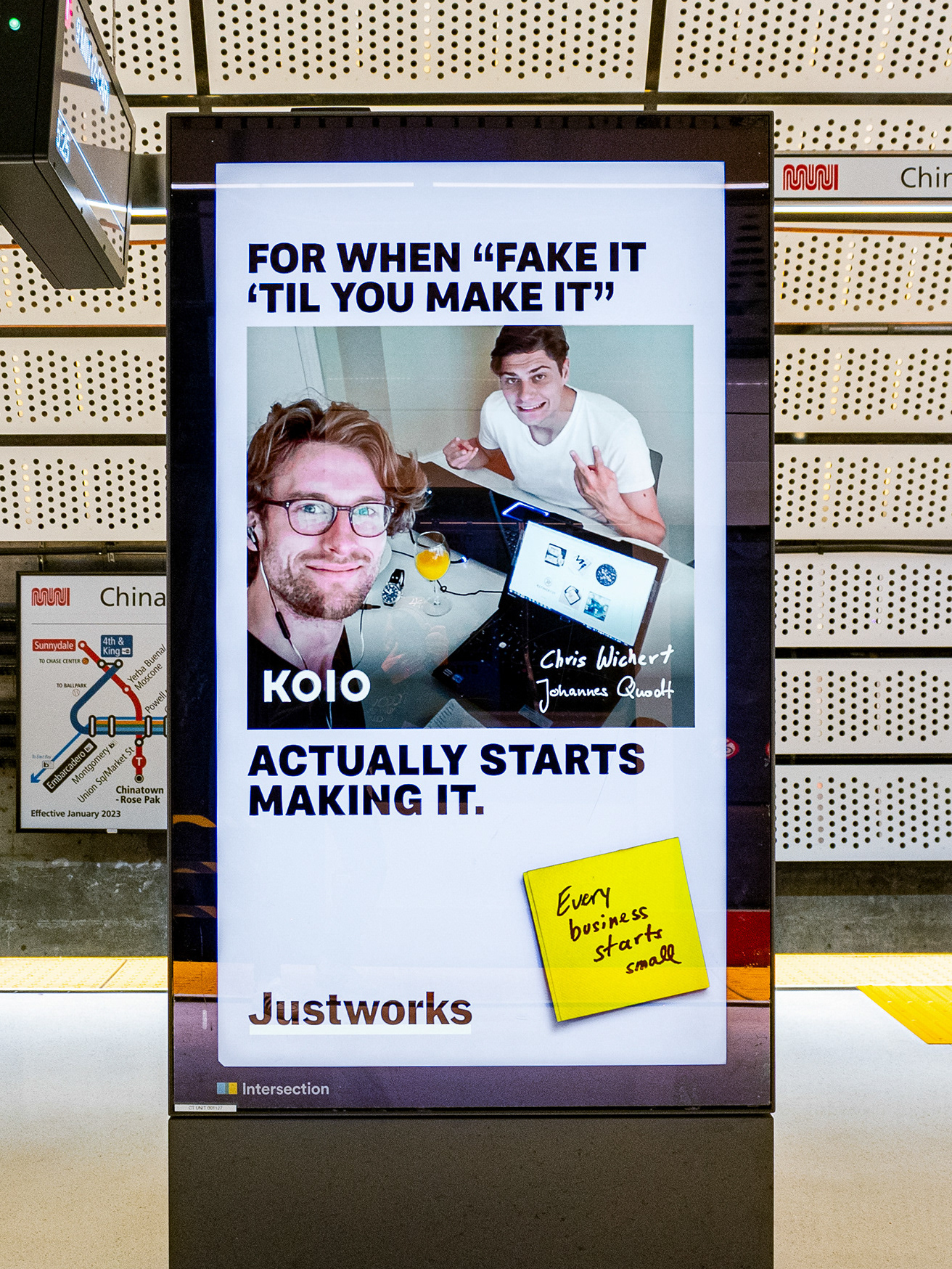
Display icons added a touch of emotion while maintaining clear and effective communication—a nice mix of brand and function.

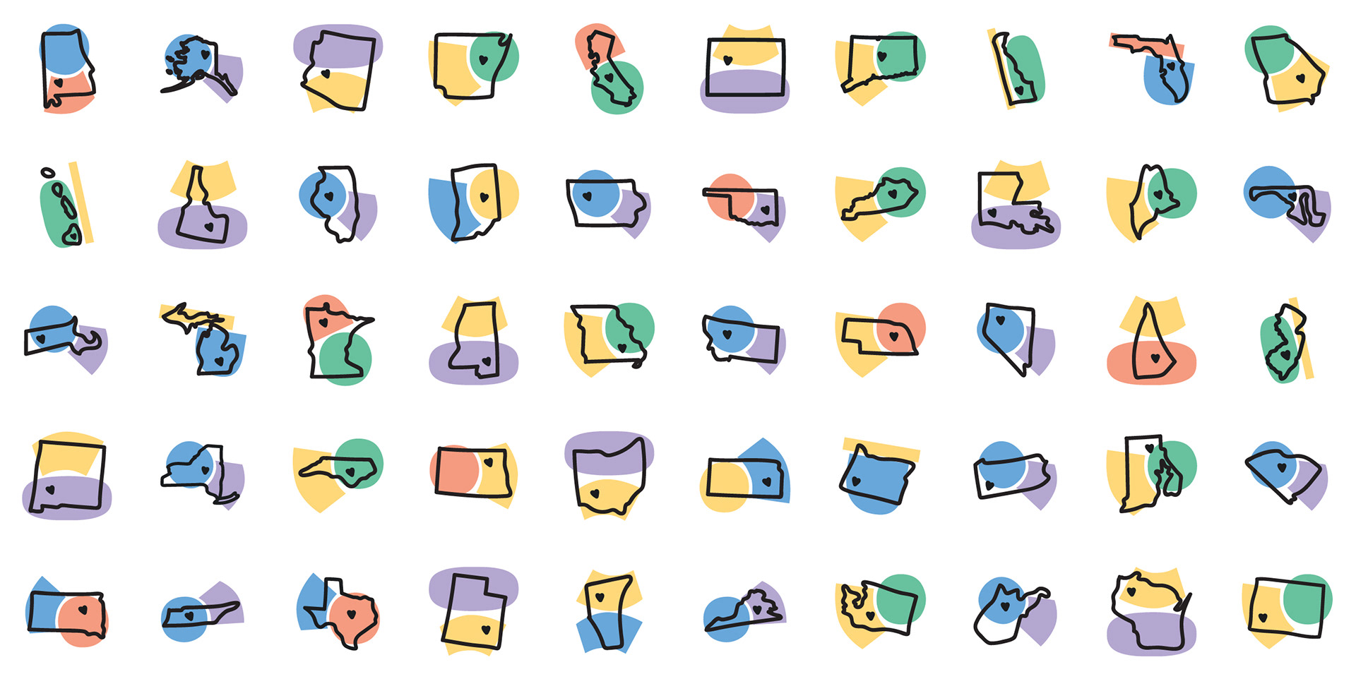
The style is flexible allowing us to make almost anything we need, like these states for our compliance pages.
When necessary, you can unify the shapes in a single color to enhance simplicity.
Or even reduce to one shape for even less complexity.


Additional color, shape, and texture explorations provided diverse ways to achieve uniformity and expression.